인기 검색 계정


일상의실천 Everyday Practice(@hello_ep) 인스타그램 상세 프로필 분석: 팔로워 90,572, 참여율 0.61%

@hello_ep
인증됨 비즈니스일상의실천 Everyday Practice
Seoul based graphic design studio member of AGI @agigraphic 📧 hello@everyday-practice.com
https://www.manifesto.ing/@hello_ep님과 연관된 프로필
mag_jpg

aabb.inc
zesstype.studio

bowyer_kr

everyblankspace
paju.typography.institute
hwf.risoclub

ordinarypeople.info
designedbyyeon

pranky26
ideatokyo


@hello_ep 계정 통계 차트
게시물 타입 분포
시간대별 활동 분석 (최근 게시물 기준)
@hello_ep 최근 게시물 상세 분석
동영상 게시물 분석
여러 장 게시물 분석
@hello_ep 최근 게시물
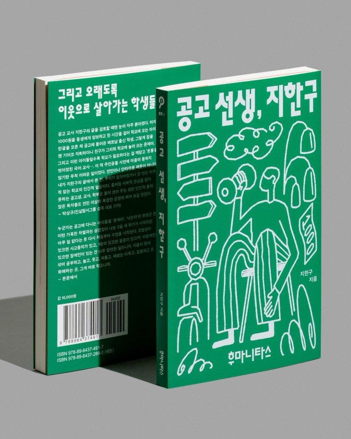
후마니타스 『공고 선생, 지한구』 『공고 선생, 지한구』는 낙인과 서열이 촘촘하게 작동하는 도시의 구조, 그 안에서 자신의 자리를 찾기 위해 흔들리는 아이들, 그리고 그들을 마주한 교사의 이야기를 통해 한국 사회가 오랫동안 외면해 온 세계를 온전히 드러냅니다. 이 책이 보여주는 현실은 한 학교의 이야기를 넘어, 후마니타스가 지속적으로 기록해 온 구조적 불평등과 주변부의 삶을 다시 사유하게 하는 흐름과 자연스럽게 이어집니다. 일상의실천은 이러한 서사를 사실적으로 재현하기보다 칠판 위의 어설픈 낙서라는 조형 언어를 통해 그 세계를 함축적으로 번역했습니다. 비뚤어진 선들이 서로 기대며 형상을 이루는 구성은 아이들의 혼란함과 어리숙함을 드러내면서도, 그 안에 존재하는 관계의 결, 느슨하지만 끊기지 않는 공동체적 리듬을 시각적으로 보여줍니다. 정제되지 않은 선들의 집합은 제도적 틀 안에서 각기 다른 조건을 가진 이들의 배열이라는 현실을 반영하는 동시에, 그 어설픔 속에서만 형성될 수 있는 조화와 연대를 암시함으로써 응축된 긍정적 이미지를 만들어냅니다. 크리에이티브 디렉터. 권준호 디자인. 임민재 사진. 김진솔 @jskstudio_official 촬영 도움. 최지수 클라이언트. 후마니타스 Humanitas Industrial High School Teacher, Ji Han-gu The book ‘Industrial High School Teacher, Ji Han-gu’ fully reveals a world long ignored by Korean society. It does so through the story of a teacher confronting children struggling to find their place within the tightly woven structure of a city where stigma and hierarchy operate relentlessly. The reality this book shows extends beyond the story of one school, naturally connecting to the flow of thought prompted by the structural inequality and lives on the margins that Humanitas has persistently documented. Rather than realistically recreating this narrative, Everyday Practice translates that world implicitly through the sculptural language of clumsy scribbles on a blackboard. The composition, where crooked lines lean against each other to form shapes, reveals the children‘s confusion and awkwardness while visually expressing the texture of relationships within them—a loose yet unbroken communal rhythm. This collection of unrefined lines reflects the reality of arranging individuals with differing conditions within institutional frameworks. Simultaneously, it forms a condensed positive image by suggesting the harmony and solidarity that can only emerge from this very clumsiness. Creative Director. Joonho Kwon Design. Minjae Lim Photography. @jskstudio_official Photography Assistant. Jisoo Choi Client. Humanitas #일상의실천 #북디자인 #그래픽디자인 #graphicdesign #everydaypractice #bookdesign #coverdesign #design
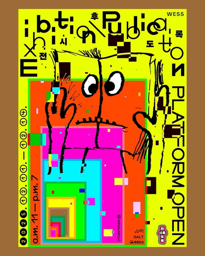
WESS 전시후도록 2025 《전시후도록》은 전시가 끝난 이후 남겨지는 ‘도록’이라는 매체를 통해, 전시 경험이 어떻게 기록되고 다시 읽힐 수 있는지를 질문하는 프로젝트입니다. 일회적으로 소비되고 사라지는 전시와 달리, 출판물은 전시 이후에도 다른 시간과 장소 속에서 반복적으로 열람되며 새로운 맥락을 만들어냅니다. 이 프로젝트는 그러한 출판물의 지속성과 전시 이후의 시간에 주목합니다. 일상의실천은 이번 디자인에서 단일한 메시지로 환원되기 어려운 전시 도록의 복합적인 성격을 시각화하고자 했습니다. 서로 다른 형식과 색, 해상도와 질감을 병치하며 전시와 출판, 기록이 뒤엉킨 상태를 구성하는 한편, 책을 바라보는 귀여운 캐릭터를 중심 요소로 배치해 ‘전시 도록’이라는 다소 무겁게 느껴질 수 있는 주제를 보다 친근하게 전달하고자 했습니다. 명확한 중심이나 위계를 두기보다는 여러 시선이 공존하는 구조를 통해, 전시 이후에도 계속해서 열리고 읽히는 출판물의 가능성을 열린 상태로 제시합니다. 크리에이티브 디렉터 & 디자인. 권준호 모션 그래픽. 정수이 클라이언트. WESS WESS Exhibition \ Publication 2025 WESS Exhibition \ Publication 2025 explores how exhibition experiences can be recorded and revisited through publications that remain after an exhibition ends. While exhibitions are often temporary and fleeting, publications continue to circulate across different times and places, generating new contexts. This project focuses on the lasting nature of publications and the time that unfolds beyond the exhibition itself. In this design, EVERYDAY PRACTICE visualizes the layered and multifaceted character of exhibition publications. By juxtaposing different formats, colors, and textures, the design brings together exhibition, publication, and record as an intertwined state. A friendly character looking at a book serves as a central element, making the potentially heavy subject of exhibition publications more approachable. Rather than defining a clear hierarchy, the design allows multiple perspectives to coexist, suggesting the open-ended possibilities of publications after the exhibition. Creative Director & Design: Joonho Kwon Motion Graphics: Sui Jeong Client: WESS #일상의실천 #graphicdesign #motiongraphic #wess #전시후도록
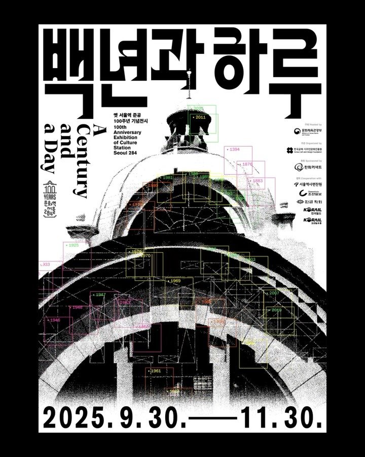
옛 서울역 준공 100주년 기념 전시 《백년과 하루: 기억에서 상상으로 / A Century and a Day》 1925년 경성역으로 출발해 해방 이후 서울역을 거쳐, 2011년부터 문화역서울284로 이어진 이 공간은 한국과 서울의 근현대사를 함께해온 장소입니다. 이번 전시는 옛 서울역 준공 100주년을 맞아, 한 세기에 걸쳐 축적된 기억의 층위를 따라가며 그 시간 위에서 다음의 하루, 그리고 미래를 상상하고자 합니다. 일상의실천은 이번 전시 디자인에서 건축의 구조와 시간의 기록을 하나의 시각적 흐름으로 엮는 데 주목했습니다. 역사적 이미지와 연도, 좌표와 흔적들을 중첩해 배치함으로써 서울역이 품어온 시간의 밀도와 변화를 드러내고, 과거의 기억이 현재를 거쳐 미래의 상상으로 이어지는 장면을 시각적으로 구성했습니다. 이를 통해 하나의 건축물이 지나온 시간이 단절된 과거가 아니라, 여전히 작동하는 현재의 조건임을 보여주고자 합니다. 크리에이티브 디렉터. 권준호 디자인. 권준호, 임민재 한글 레터링 디자인. 김태룡 모션그래픽. 최지수 사진. 김진솔 Exhibition Commemorating the 100th Anniversary of the Former Seoul Station 《A Century and a Day: From Memory to Imagination》 Originally opened in 1925 as Gyeongseong Station and later reborn as Culture Station Seoul 284, this site has stood alongside the modern and contemporary history of Korea and Seoul. Marking its 100th anniversary, the exhibition traces the layered memories accumulated over a century and invites reflection on the day that follows, and the future beyond. In designing this exhibition, EVERYDAY PRACTICE focused on connecting architectural structures and records of time into a cohesive visual flow. Historical images, years, and traces are overlaid to reveal the density of time embedded in Seoul Station, presenting scenes where past memories pass through the present and extend toward future imagination. Creative Director. Joonho Kwon Design. Joonho Kwon, Minjae Lim Title Design. Tearong Kim Mobile Leaflet Design & Development. Nawon Yang Motion Graphics. Jisoo Choi Photography. Jinsol Kim #일상의실천 #graphicdesign #motiongraphic #서울역 #서울역100주년전시 #문화역서울 #문화역서울284 #design #poster #3d #editorialdesign
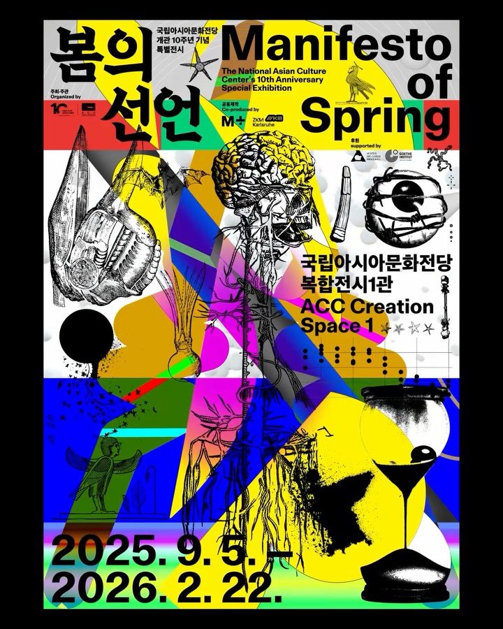
국립아시아문화전당 개관 10주년 기념 특별전 《봄의 선언》 《봄의 선언》은 민주주의의 상징으로 작동해온 ‘봄’의 의미가 오늘의 사회·정치·생태적 조건 속에서 어떻게 변모해왔는지를 살펴보는 전시입니다. 아시아 근현대사의 격변과 자본, 식민주의, 기후 위기가 교차하는 지점에서 동시대의 저항과 연대의 가능성을 질문합니다. 일상의실천은 이번 전시의 디자인에서 하나의 메시지로 정리되기 어려운 복합적인 서사에 주목했습니다. 서로 다른 시대의 이미지, 인체와 비인간, 과학적 도식과 상징적 형태들을 병치하고 충돌시키며, 민주주의와 생태, 인간과 비인간이 얽힌 현재의 조건을 시각적으로 드러내고자 했습니다. 명확한 중심을 두기보다 여러 시선이 공존하는 구조를 통해, 《봄의 선언》이 던지는 질문을 열린 상태로 제시합니다. 크리에이티브 디렉터. 권준호 디자인. 권준호, 박세희 모션그래픽. 최지수 사진. 김진솔 클라이언트. 국립아시아문화전당 The National Asian Culture Center’s 10th Anniversary Special Exhibition Manifesto of Spring Manifesto of Spring explores how the meaning of “spring,” long regarded as a symbol of democracy, has transformed under today’s social, political, and ecological conditions. At the intersection of Asia’s modern and contemporary upheavals—capital, colonialism, and the climate crisis—the exhibition questions the possibilities of resistance and solidarity in our time. In designing this exhibition, EVERYDAY PRACTICE focused on narratives that resist being reduced to a single message. Images from different eras, the human body and non-human entities, scientific diagrams, and symbolic forms are juxtaposed and allowed to collide, revealing the complex conditions in which democracy and ecology, humans and non-humans, are entangled today. Rather than establishing a clear center, the design embraces a structure where multiple perspectives coexist, presenting the questions posed by Manifesto of Spring as open and unresolved. Creative Director. Joonho Kwon Design. Joonho Kwon, Sehee Park Motion Graphics. Jisoo Choi Photography. Jinsol Kim Client. National Asian Culture Center #일상의실천 #graphicdesign #motiongraphic #acc #국립아시아문화전당
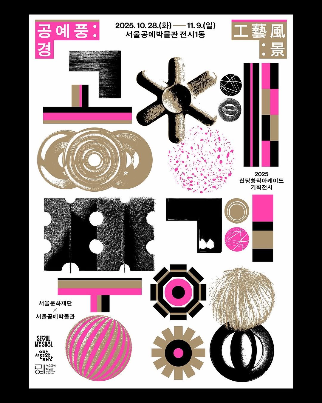
공예풍:경 (工藝風:景) 신당창작아케이드는 신진 작가들을 대상으로 다양한 창작지원 프로그램을 지원하는 서울시 대표 공예•디자인 특화공간입니다. 일상의실천은 신당창작아케이드에서 주최하는 2025년 기획전시 《공예풍:경 (工藝風:景)》의 키비주얼을 디자인했습니다. 키비주얼에서는 공예적 감각을 바탕으로 만든 기하학적 오브제를 디자인 요소로 활용했습니다. 공예품의 물성을 추상적인 그래픽으로 재구성하여 은유적으로 드러내고, 형광 별색과 금색을 대비시켜 현대성과 전통성을 함께 표현했습니다. 앞서 만든 기하학적 형태의 오브제들을 조합해 전시명 ‘공예풍:경’의 글자 형태를 구성함으로써, 전시의 정체성을 시각적으로 더욱 선명하게 드러냈습니다. 도록 표지는 키 비주얼의 오브제를 해체해 금박과 실크 인쇄로 형태감을 보다 선명하게 표현했습니다. 내지는 여백을 중심으로 서정적이고 차분한 구성으로 정리하고, 금색을 키 컬러로 사용해 전체 톤앤매너를 담백하게 구성했습니다. 각 파트의 간지에는 도자·금속·섬유 등 재료의 질감을 그래픽 요소로 적용해 자연스럽게 이어지는 흐름을 만들었습니다. 크리에이티브 디렉터. 김어진 디자인. 박세희 클라이언트. 신당창작아케이드 Craft Wind:Scene (工藝風:景) Seoul Art Space Sindang is Seoul’s representative craft and design hub, offering a variety of creative support programs for emerging artists. Everyday Practice designed the key visual for the 2025 curated exhibition Craft Wind:Scene (工藝風:景) organized by Seoul Art Space Sindang. For the key visual, we used geometric objects developed through a craft-inspired approach as the primary design elements. The inherent materiality of craft objects was reinterpreted into abstract graphics, while the contrast between fluorescent spot colors and gold expressed both modernity and tradition. These geometric forms were combined to construct the letterforms of the exhibition title Craft Wind : Scene, giving the exhibition identity a clear visual presence. The exhibition book cover deconstructs the key-visual objects and renders them with gold foil and silkscreen printing to highlight their form. The inner pages follow a calm, spacious layout, using gold as the key color to maintain a cohesive tone and manner. Insert pages for each section incorporate graphic elements inspired by the textures of ceramics, metal, and textiles, creating a seamless visual flow throughout the publication. Creative Director. Eojin Kim Design. Sehee Park Client. Seoul Art Space Sindang #일상의실천 #everydaypractice #posterdesign #graphicdesign #editorialdesign

La Vie Magazine 10월호 커버 디자인 대만 문화 매거진 La Vie Magazine @lavietw 10월호 커버 디자인을 진행했습니다. 한국 디자인의 에너지와 다층적 구조를 확장된 색 스펙트럼과 동심원 그래픽으로 표현하며, 전통 색을 현대적으로 재해석했습니다. 이번 특집은 K-POP, 영화, 패션, 공예, 건축 등 다양한 분야의 한국 창작자들을 소개하고, 한류 콘텐츠 뒤에 있는 디자이너들의 역할을 조명합니다. 일상의실천을 포함한 여러 크리에이터의 작업이 함께 실려 있습니다. 한국 디자인을 깊이 있게 다뤄주신 La Vie 매거진 관계자분들께 감사드립니다. 크리에이브 디렉터 & 디자인. 권준호 3D & 모션. 최지수 사진. 김진솔 클라이언트. La Vie Magazine Cover for the October issue of La Vie Magazine We designed the cover for the October issue of La Vie Magazine @lavietw, a cultural publication based in Taiwan. The graphic concept interprets the energy and layered structure of Korean design through an expanded color spectrum and concentric waves inspired by traditional Korean colors. This special feature introduces creators from various fields—K-pop, film, fashion, crafts, and architecture—shedding light on the designers behind the Korean Wave. It also includes interviews and works by Everyday Practice and many other Korean creatives. We appreciate the La Vie Magazine team for their thoughtful and in-depth coverage of Korean design. Creative directior & design. Joonho Kwon 3D & motion. Jisu Choi Photography. @jskstudio_official Client. La Vie Magazine #일상의실천 #laviemagazine #everydaypractice #grapgicdesign #editorialdesign
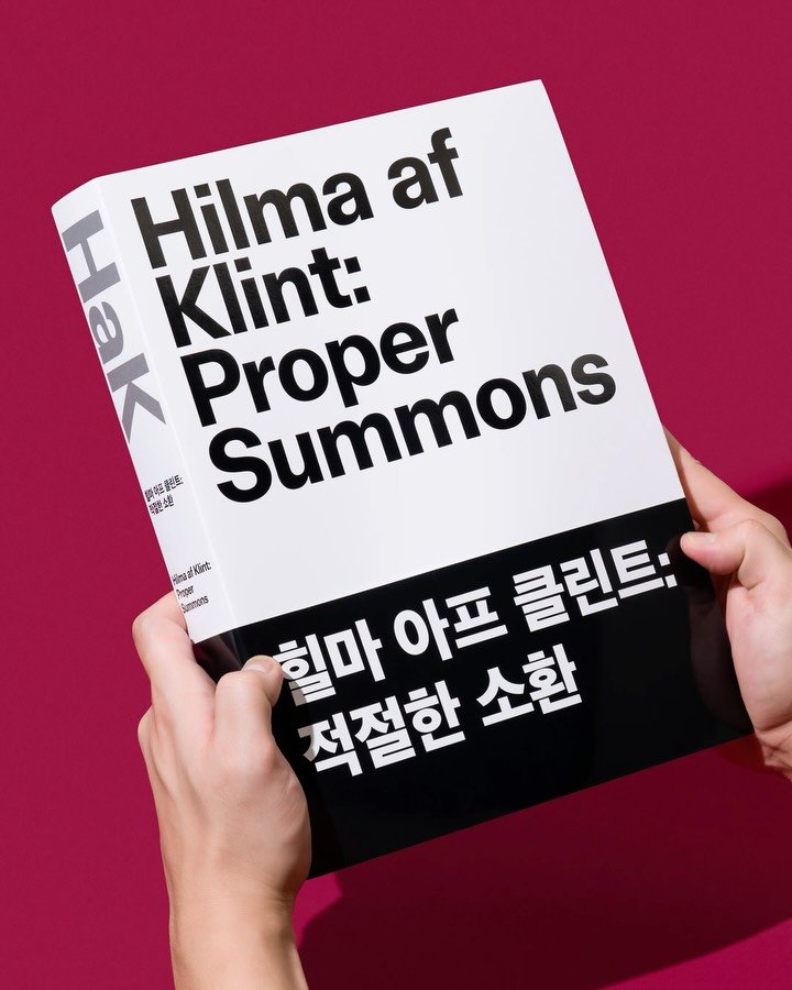
<힐마 아프 클린트: 적절한 소환> 도록 부산현대미술관에서 주최한 <힐마 아프 클리트: 적절한 소환>은 서양 미술사 최초의 추상 미술을 선보인 스웨덴 출신 작가 ‘힐마 아프 클린트’의 작품을 선보이는 전시입니다. 이번 전시는 ‘형식과 의미의 만남’이라는 특색을 담고 있는 힐마 아프 클린트의 작품을 통해 과거와 현재의 연결고리를 새로운 시각으로 살펴보고 있습니다. 본 도록은 힐마 아프 클린트의 생애와 작가로 성장한 배경 그리고 작가로서 자신만의 세계를 구축한 그녀의 학문에 대한 탐구 정신을 이야기합니다. 또한 작가의 생애를 관통하는 주요 작품과 함께 그녀의 다양한 생각을 담은 여러 권의 공책 도판을 모두 담고 있습니다. 본 도록 디자인은 힐마 아프 클린트의 작품 번호 정보를 통해 도판을 소환하는 동시에, 그녀의 사상적인 흐름과 작품 세계의 완성을 560페이지 분량으로 설명하고 있습니다. 디자인. 김어진 사진. 김진솔 클라이언트. 부산현대미술관 Hilma af Klint: Proper Summons Catalogue Hosted by the MoCA Busan (Busan Museum of Contemporary Art), <Hilma af Klint: Proper Summons> is an exhibition showcasing the works of Swedish artist Hilma af Klint, who presented the first abstract art in Western art history. This exhibition examines the connection between past and present through a fresh perspective, using Hilma af Klint’s works characterized by the ‘encounter of form and meaning’. This catalogue narrates Hilma af Klint’s life, the background of her artistic development, and her scholarly spirit in constructing her unique artistic world. It also includes plates of major works spanning her career alongside numerous notebooks containing her diverse thoughts. The design of this catalogue evokes the plates through Hilma af Klint‘s work number system, while simultaneously explaining the evolution of her philosophical thought and the completion of her artistic world across 560 pages. Design. Eojin Kim Photography. @jskstudio_official Client. MoCA Busan #hilmaafklink #일상의실천 #everydaypractice #grapgicdesign #editorialdesign
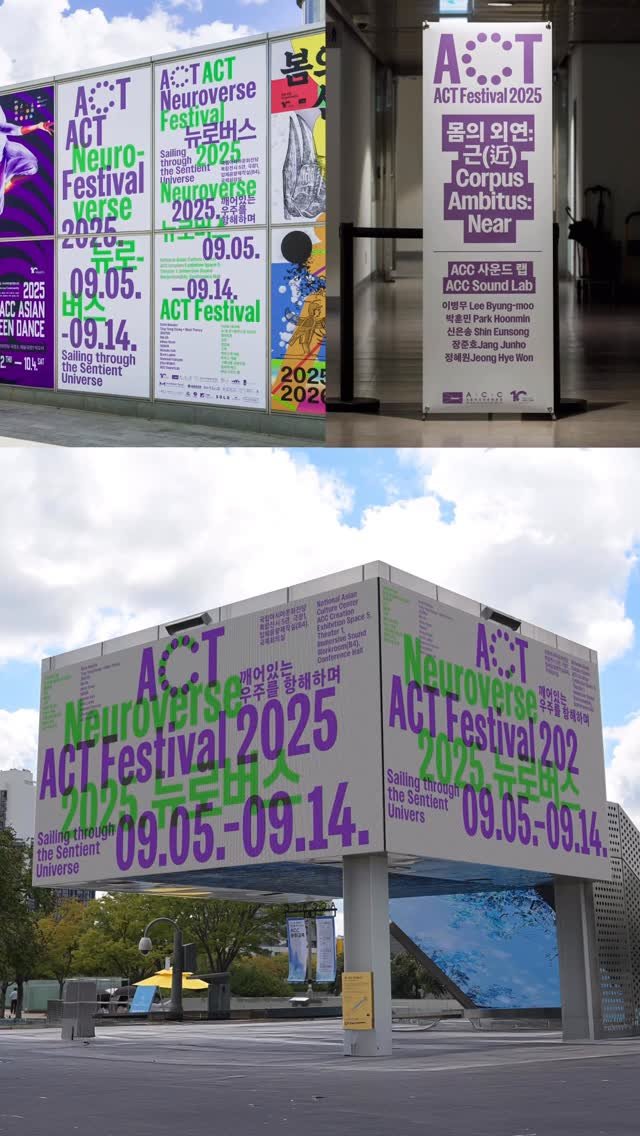
ACT Festival 2025 <ACT 페스티벌>은 국립아시아문화전당(ACC)에서 개최하는 예술과 기술의 융복합 미디어 아트 페스티벌입니다. ACT 페스티벌 2025의 주제는 ‘Neuroverse 뉴로버스’입니다. ‘뉴로버스(Neuroverse)’는 뇌 신경망(Neural Network)과 우주(Universe)의 합성어로 인간, 기계, 세계가 뉴런(신경세포)과 같은 살아있는 연결망으로 작동하는 동시대의 감각적 세계관을 의미합니다. 일상의실천은 지난 9회 <ACT 페스티벌>에서 처음 선보인 아이덴티티와 주요 시스템을 바탕으로, ‘뉴로버스(Neuroverse)’의 정의를 타이포그래피 중심의 키비주얼에서 3차원 공간의 깊이감과 연결망을 상징하는 구조를 활용해 시각화했습니다. 또한 이번 행사에 포함된 전시 섹션은 키비주얼에서 사용된 연결망을 상징하는 레이아웃을 응용하여 공간 전반에 활용했습니다. 크리에이티브 디렉터. 김어진 디자인. 김어진, 양현호 모션그래픽. 양현호 촬영. 김진솔 클라이언트. 국립아시아문화전당 <ACT Festival> is a media arts festival which is complex of art and technology, organized by the National Asian Culture Center (ACC). The theme for ACT Festival 2025 is ‘Neuroverse’. ’Neuroverse‘ is a portmanteau of ‘Neural Network’ and ‘Universe,’ signifying a contemporary sensory worldview where humans, machines, and the world operate as living networks akin to neurons. Building upon the identity and core systems first introduced at the 9th ACT Festival, Everyday Practice visualized the definition of ‘Neuroverse’ through a typography-centric key visual. This visualization employs structures symbolizing the depth of three-dimensional space and interconnected networks. Furthermore, the layout applied in the key visual, symbolizing these interconnected networks, was adapted and utilized throughout the entire exhibition space included in this event. Creative Director. Eojin Kim Design. Eojin Kim, Hyunho Yang Motiongraphic. Hyunho Yang Photography. @jskstudio_official Client. National Asian Culture Center (ACC) #ACTFESTIVAL #일상의실천 #Posterdesign #graphicdesign
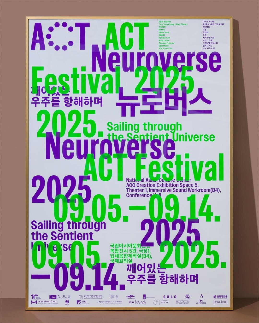
ACT Festival 2025 <ACT 페스티벌>은 국립아시아문화전당(ACC)에서 개최하는 예술과 기술의 융복합 미디어 아트 페스티벌입니다. ACT 페스티벌 2025의 주제는 ‘Neuroverse 뉴로버스’입니다. ‘뉴로버스(Neuroverse)’는 뇌 신경망(Neural Network)과 우주(Universe)의 합성어로 인간, 기계, 세계가 뉴런(신경세포)과 같은 살아있는 연결망으로 작동하는 동시대의 감각적 세계관을 의미합니다. 일상의실천은 지난 9회 <ACT 페스티벌>에서 처음 선보인 아이덴티티와 주요 시스템을 바탕으로, ‘뉴로버스(Neuroverse)’의 정의를 타이포그래피 중심의 키비주얼에서 3차원 공간의 깊이감과 연결망을 상징하는 구조를 활용해 시각화했습니다. 또한 이번 행사에 포함된 전시 섹션은 키비주얼에서 사용된 연결망을 상징하는 레이아웃을 응용하여 공간 전반에 활용했습니다. 크리에이티브 디렉터. 김어진 디자인. 김어진, 양현호 모션그래픽. 양현호 포스터 인쇄. @screenartagency 촬영. 김진솔 클라이언트. 국립아시아문화전당 <ACT Festival> is a media arts festival which is complex of art and technology, organized by the National Asian Culture Center (ACC). The theme for ACT Festival 2025 is ‘Neuroverse’. ’Neuroverse‘ is a portmanteau of ‘Neural Network’ and ‘Universe,’ signifying a contemporary sensory worldview where humans, machines, and the world operate as living networks akin to neurons. Building upon the identity and core systems first introduced at the 9th ACT Festival, Everyday Practice visualized the definition of ‘Neuroverse’ through a typography-centric key visual. This visualization employs structures symbolizing the depth of three-dimensional space and interconnected networks. Furthermore, the layout applied in the key visual, symbolizing these interconnected networks, was adapted and utilized throughout the entire exhibition space included in this event. Creative Director. Eojin Kim Design. Eojin Kim, Hyunho Yang Motiongraphic. Hyunho Yang Poster printed by. @screenartagency Photography. @jskstudio_official Client. National Asian Culture Center (ACC) #ACTFESTIVAL #일상의실천 #Posterdesign #graphicdesign #Motiongraphic
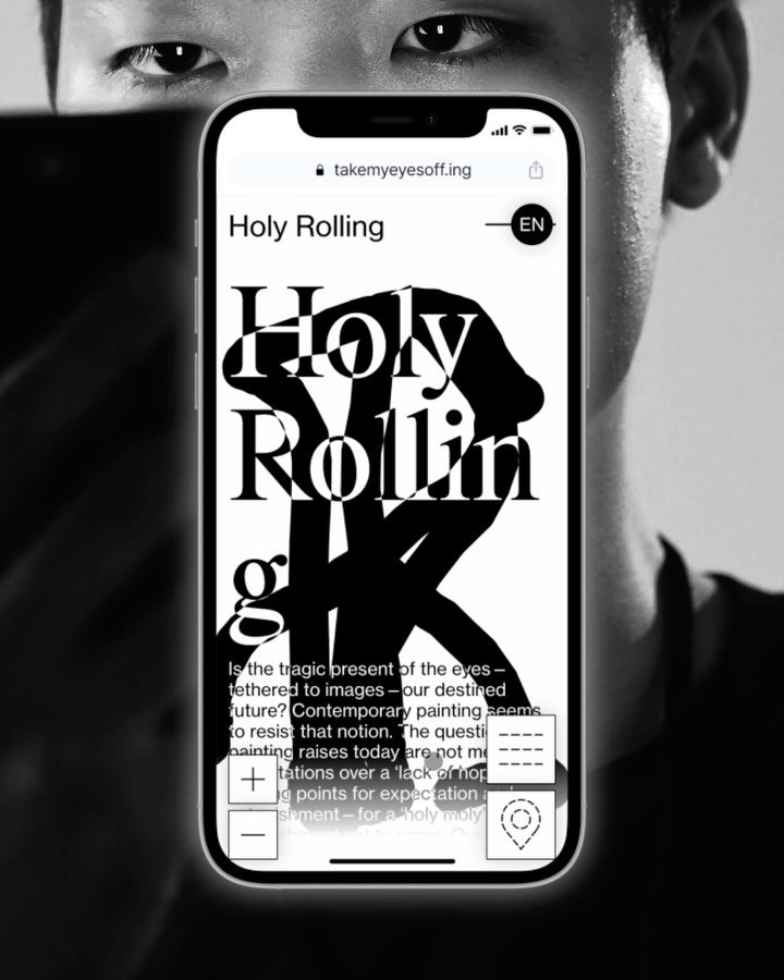
<떨어지는눈> 모바일 리플렛 서울시립 북서울 미술관에서 열린 <떨어지는 눈>은 눈(Eye)을 다양한 행위의 매개체로 인식하고, 눈을 통해 한국 동시대 회화를 행동의 관점으로 바라보는 전시입니다. 눈은 피사체에 반응하는 수동적인 감각 기관인 동시에 피사체를 탐색하는 능동적인 감각 기관입니다. 두 개의 역할을 함께 수행하는 눈의 특성은 관람객에게 객체이자 주체의 경험을 제안하고 있습니다. <떨어지는눈> 모바일 리플렛은 전시의 핵심 개념인 ‘눈(Eye)’의 존재를 섬세하게 감각하도록 하기 위해, 사용자가 웹사이트에 체류하는 동안, 시선추적(Eye Tracking) 기술을 사용하여 사용자의 시선을 따라 키 비주얼을 그려내는 방식으로 구현하였습니다. 또한, 전시의 시각 언어를 유지하면서도 관람자가 자연스럽게 정보를 탐색할 수 있도록 디자인 및 개발 하였습니다. 크리에이티브 디렉터. 김어진 모바일 리플렛 디자인. 김어진 개발. 신지웅 클라이언트. 서울시립 북서울미술관 https://takemyeyesoff.ing/ <Take My Eyes Off> Mobile Leaflet <Take My Eyes Off> at the Buk-Seoul Museum of Art(SeMA Buk-Seoul) explores the eye not just as a passive organ that reacts to what it sees, but also as an active tool that looks and searches. This exhibition looks at contemporary Korean painting through the actions of seeing. <Take My Eyes Off> mobile leaflet was designed to let visitors subtly sense the presence of the exhibition’s core concept, the “Eye.” While staying on the site, the user’s gaze is tracked with eye-tracking technology to generate the key visual in real time. The design and development also focus on preserving the exhibition’s visual language while allowing visitors to navigate the information intuitively and with ease. Creative Director. Eojin Kim Mobile Leaflet Design. Eojin Kim Development. Jiwoong Shinn Client. 서울시립 북서울미술관 #일상의실천 #everydaypractice #website #webdesign #graphicdesign
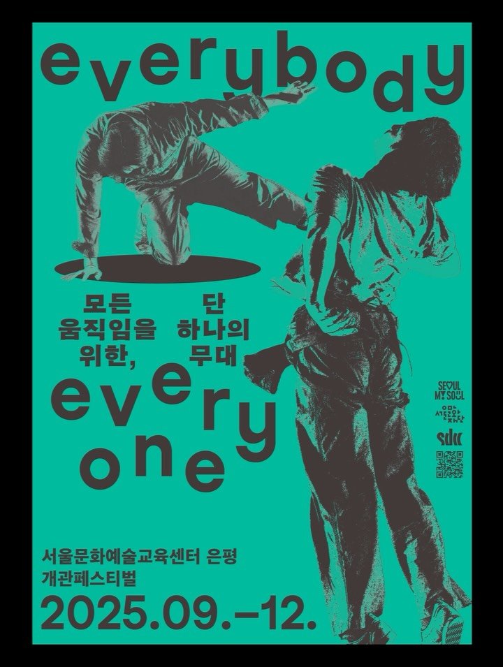
서울문화예술교육센터 은평 개관 페스티벌 키비주얼 디자인 서울문화예술교육센터 은평(무용창작센터)은 국내외 무용 공연을 관람할 수 있는 공연장이자, 예술놀이부터 전문 실기 강습까지 폭넓은 무용 교육 프로그램을 운영하는 복합 예술공간입니다. 일상의실천은 개관 페스티벌의 전체 키비주얼 아이덴티티를 총괄하며, 센터가 지향하는 ‘신체를 통한 예술의 확장’을 시각적으로 풀어내는 데 집중했습니다. 메인 키비주얼에서는 무용수의 ‘신체’와 ‘동작’을 중심으로 에너지와 역동성을 부각했습니다. 비정형 타이포그래피와 다채로운 색감을 활용해 개관 페스티벌의 경쾌한 분위기를 표현하고, 인물과 배경을 분리한 구성으로 더욱 입체적인 장면을 완성했습니다. 공연별 키비주얼은 각 작품이 펼쳐지는 ‘무대’의 현장감과 리듬을 시각적으로 구성하는 데 주력했습니다. 서체와 레터링을 유기적으로 혼용해 장면의 흐름을 표현하고, 라인과 타이포그래피로 구성한 프레임을 통해 무대의 구조적 생동감과 분위기를 담아냈습니다. 크리에이티브 디렉터. 김어진 디자인. 박세희 클라이언트. 서울문화예술교육센터 은평 Seoul Dance Creation Center (SDCC) Opening Festival Key Visual Design Seoul Dance Creation Center (SDCC) is a multidisciplinary arts space that operates both as a venue for domestic and international dance performances and as an educational hub offering programs ranging from creative movement activities to advanced professional dance training. Everyday Practice led the overall key visual identity for the center’s opening festival, focusing on visually articulating SDCC’s core vision: the expansion of art through the body. The main key visual highlights the energy and dynamism of the dancer’s body and movement. It expressed the opening festival‘s lively atmosphere using non-traditional typography and vibrant colors, while separating the figure from the background to create a more three-dimensional scene. For the individual performance visuals, the design emphasizes the rhythm and immediacy of the stage. Fonts and lettering were organically blended to express the flow of the scene, while frames composed of lines and typography captured the structural vitality and atmosphere of the stage. Creative Director. Eojin Kim Design. Sehee Park Client. Seoul Dance Creation Center (SDCC) #서울문화예술교육센터은평 #서울무용창작센터 #SDCC #일상의실천 #everydaypractice #graphic #graphicdesign #identity
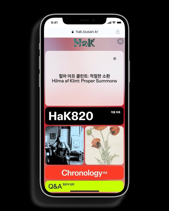
<힐마 아프 클린트: 적절한 소환> 웹사이트 & 전시 부산현대미술관에서 주최한 <힐마 아프 클린트: 적절한 소환>은 서양 미술사 최초의 추상 미술을 선보인 스웨덴 출신 작가 ‘힐마 아프 클린트’의 작품을 선보이는 전시입니다. 이번 전시는 ‘형식과 의미의 만남’이라는 특색을 담고 있는 힐마 아프 클린트의 작품을 통해 과거와 현재의 연결고리를 새로운 시각으로 살펴보고 있습니다. <힐마 아프 클린트: 적절한 소환> 전시의 웹사이트는 시대를 앞서나갔던 급진적인 작가의 작품세계를 표현함과 동시에 전시의 다양한 컨텐츠를 최소한의 접근 경로로 담아내는 것을 목표로 기획 및 제작되었습니다. 작가의 작품 위에 부유하듯 띄워진 전시의 각각 컨텐츠들은 서로 유기적으로 동작하며 작품세계 안에 녹아들고, 이는 전시의 방문객과 사용자들에게 더욱 몰입도 높은 환경을 구성합니다. 크리에이티브 디렉터. 김어진, 김경철 웹사이트 디자인. 김어진, 신지웅 개발. 신지웅 디자인 및 개발 도움. 장은아 사진. 김어진 클라이언트. 부산현대미술관 https://www.hak.busan.kr <Hilma af Klint: Proper Summons> Website & Exhibition Hosted by the MoCA Busan (Busan Museum of Contemporary Art), <Hilma af Klint: Proper Summons> is an exhibition showcasing the works of Swedish artist Hilma af Klint, who presented the first abstract art in Western art history. This exhibition examines the connection between past and present through a fresh perspective, using Hilma af Klint’s works characterized by the ‘encounter of form and meaning’. The exhibition website for <Hilma af Klint: Proper Summons> was designed and developed to reflect the radical, forward-thinking nature of the artist while providing a minimal and intuitive access path to the exhibition’s diverse content. Each piece of information floats above the artist’s imagery like a spatial layer, interacting organically and blending into her visual universe—ultimately creating a more immersive environment for visitors and users. Creative Director. Eojin Kim, Kyungchul Kim Website Design. Eojin Kim, Jiwoong Shinn Development. Jiwoong Shinn Design & Development Support. Euna Jang Photography. Eojin Kim #일상의실천 #everydaypractice #graphicdesign #website #webdesign #webdevelopment