인기 검색 계정


AG타이포그라피연구소(@ag.typography.institute) 인스타그램 상세 프로필 분석: 팔로워 14,109, 참여율 0.55%
@ag.typography.institute
비즈니스AG타이포그라피연구소
AG 타이포그라피연구소는 연구를 바탕으로 글꼴을 멋짓고 키우며 새로운 글꼴 문화와 흐름을 만들고자 합니다. 📩 문의 agfont@ag.co.kr
https://agfont.com/@ag.typography.institute님과 연관된 프로필
연관 프로필이 없습니다
이 계정에 대한 연관 프로필 정보를 찾을 수 없습니다
@ag.typography.institute 계정 통계 차트
게시물 타입 분포
시간대별 활동 분석 (최근 게시물 기준)
@ag.typography.institute 최근 게시물 상세 분석
동영상 게시물 분석
여러 장 게시물 분석
@ag.typography.institute 최근 게시물
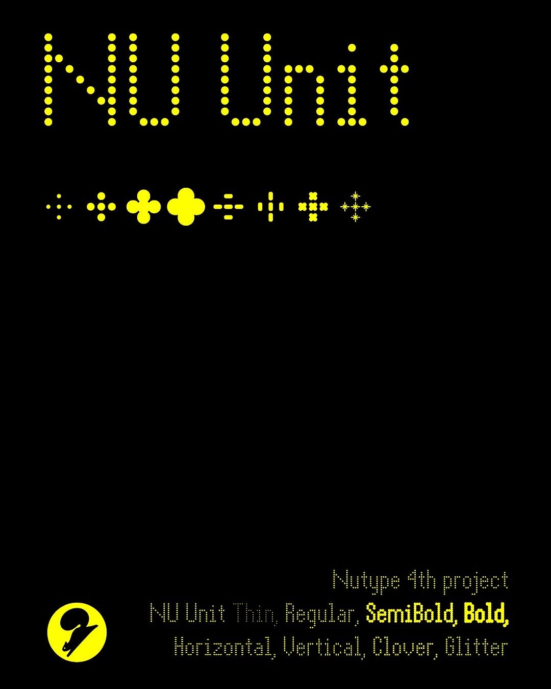
«새 글꼴 NU 유닛 @nutype.info 입점» NU 유닛 글꼴이 입점되었습니다. «NU 유닛»은 모든 언어적・조형적 체계가 최소 단위에서 시작해 확장된다는 원리에 주목한 프로젝트입니다. 점과 획이 모여 자소를 이루고, 자소가 결합해 글자가 되며, 글자들이 모여 의미있는 텍스트를 구성하듯, 폰트 또한 유닛(unit)이라는 최소 단위를 기반으로 구축됩니다. 이러한 기획 의도에 따라 다양한 스타일로 확장되는 도트 폰트 형태로 설계하였고, 각 스타일은 겹쳐 쓰는 등의 추가적인 결합이 가능하도록 모든 도트가 동일한 간격을 가지도록 디자인했습니다. 새 글꼴 〈NU 유닛〉을 agfont.com에서 만나 보세요!
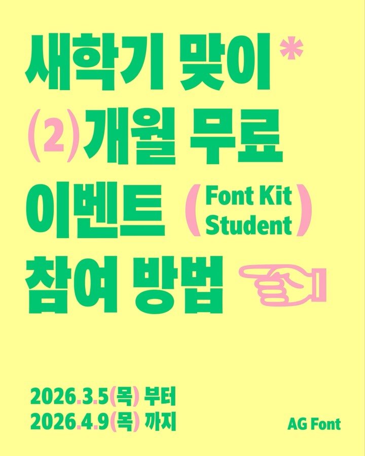
새 학기, 지금 가입하면 바로 받는 혜택.ᐟ 신규 학생 회원 전원 👉 2개월 할인 쿠폰 자동 발급 ⏳ 이벤트 종료 후에는 제공되지 않습니다. ⸻ 새로 시작하는 시기, 작업의 첫 시작을 준비해보세요. AG Font가 준비한 작은 선물도 함께 받아가세요. ⸻ 🎁 이벤트 (2가지) ① 친구와 함께 → 〈최정호 순명조 글꼴보기집〉 2명 ② 나의 시작 기록 → 〈AG 안상수체 2012 L·M·B〉 1개월 사용권 ⸻ 📌 참여 방법 [이벤트 ①] ✔ 댓글에 친구 태그 ✔ 게시글 스토리 공유 [이벤트 ②] ✔ 학생 이메일로 회원가입 ✔ 아이디가 보이게 캡처 ✔ 스토리 공유 + @ag.typography.institute 태그 ✔ 공개 계정만 참여 가능
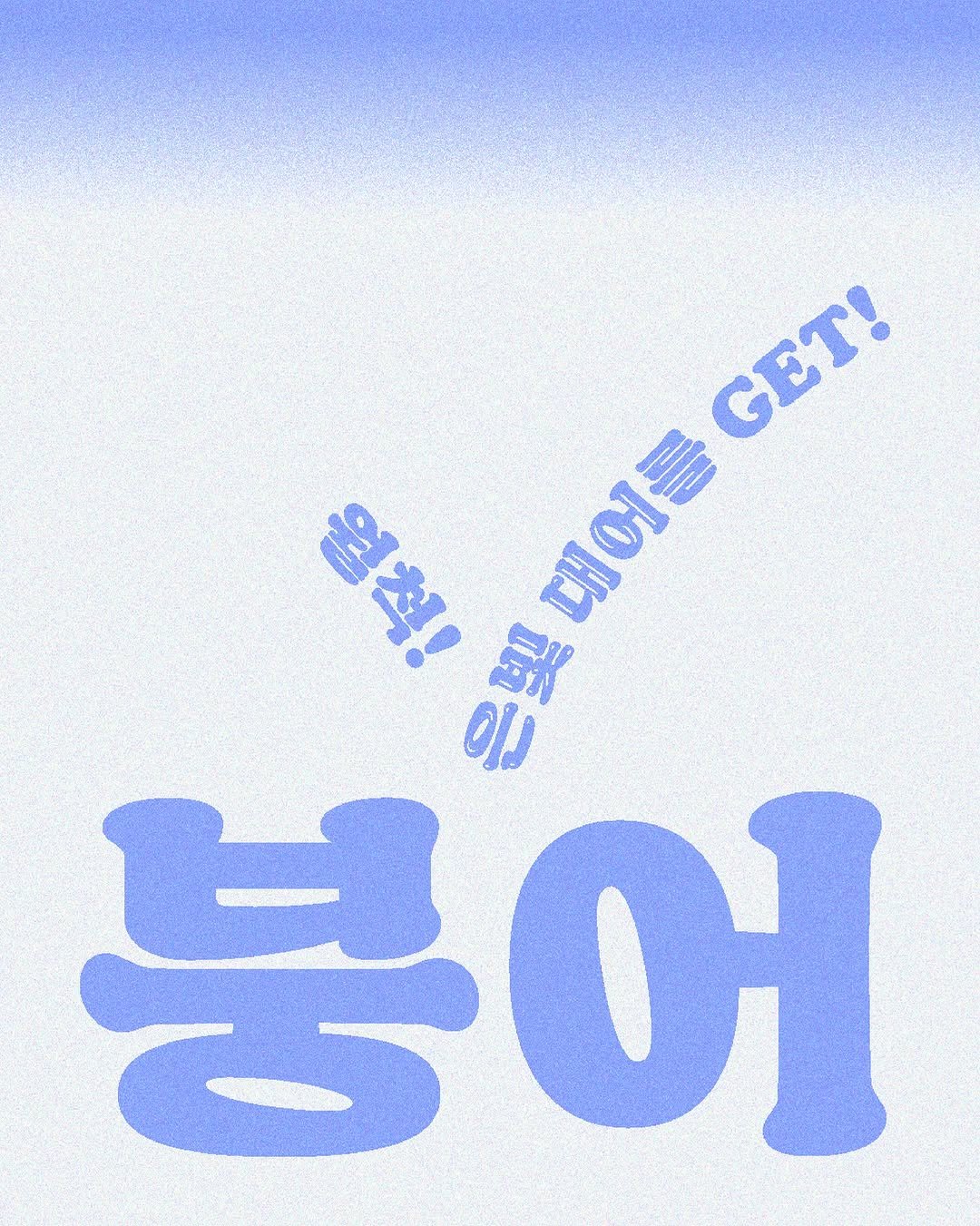
«새 글꼴 붕어 @toyom.or.tyom 입점» 붕어 글꼴이 입점되었습니다. 《붕어》는 《Cooper Black(쿠퍼 블랙)》에 영감을 받아 제작한 제목용 글꼴입니다. 무겁고 둥그런 인상과 과감한 획 표현은 따라가되 한글의 모아쓰기 구조에 어울리도록 새롭게 질서를 잡았습니다. 정방형을 가득 채운 구조에 굵은 획으로 견고함을 더했고, 글자의 하단부가 부드럽게 밑선과 닿아있어 큰 몸집에도 베개의 폭신함이 느껴지는 것이 특징입니다. 이러한 인상을 담아 직접 발음하기에도 부드러운 ‘붕어’로 이름을 붙였습니다. 확장된 쓰임새를 위해 함께 제작한 《붕어-글로시》는 반짝거리는 은빛 붕어의 외형적 특징을 연상케 합니다. 새 글꼴 〈붕어〉를 agfont.com에서 만나 보세요!
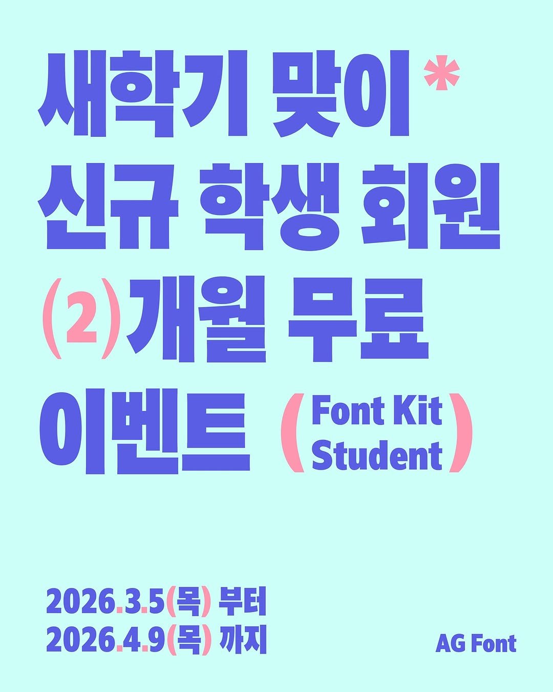
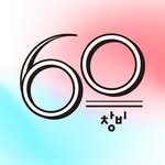
새학기 맞이 [신규 학생 회원] “2개월 무료” 이벤트 이벤트 기간에 AG Font에 회원가입하는 학생 회원 모두에게 기존 12개월 60,000원에 판매되던 학생 라이선스를 12개월 50,000원에 구매할 수 있는 쿠폰을 드립니다. *2026.3.5(목)부터 2026.4.9(목) 까지 진행됩니다. *학생 회원은 학교 이메일을 통한 회원가입시에 적용됩니다. *쿠폰은 학생 회원 [연 결제 상품]만 적용 가능합니다. *현재 Font Kit은 MAC OS만 사용 가능하십니다. *빠른 시일내에 Window를 지원할 수 있도록 하겠습니다.
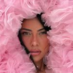
![ag.typography.institute 게시물 이미지: [안체 프로젝트 전시 종료 안내]
내일은 전시의 마지막 날입니다. 마지막 까지 많은...](/static/images/dashboard/ag.typography.institute/2b0bdf2cc8c0f7ff4f29803053b06c4c.jpg)
[안체 프로젝트 전시 종료 안내] 내일은 전시의 마지막 날입니다. 마지막 까지 많은 관심 부탁드리며, 현장 관람을 놓치신 분들을 위해 전시의 기록을 담은 도록을 준비했습니다. 현재 사전 예약 할인가로 구매 가능하니, 프로필 링크를 확인해 주세요. ⟪안체 프로젝트 A-Project⟫는 ‘AG 안상수체’ 탄생 40주년을 기념해 진행되는 협업 프로젝트로, 참여 디자이너는 ‘AG 안상수체’ 모듈을 활용해 새로운 탈네모틀 한글꼴을 제작하고, 연구소는 디자이너가 11,172자의 한글을 완성할 수 있도록 제작 과정을 지원하고 있습니다. 2024년 첫 프로젝트에서 탄생한 14종의 한글꼴은 다양한 문화예술 매체를 통해 소개되며 주목을 받았고, 2025년에는 보다 폭넓은 문화·언어권의 디자이너들이 합류해 세벌체에 대한 관점과 조형의 폭을 넓혔습니다. 완성된 글꼴은 2026년 가을에 공개될 예정이며, 현재 후속 프로젝트가 진행 중입니다. ⟪안체 프로젝트 A-Project⟫ 때. 2026년 1월 27일(화) – 2월 6일(금) 평일, 토요일 10:00 – 17:00 / 일요일 휴관 곳. 두성페이퍼갤러리 (서울 서초구 사임당로23길 41)
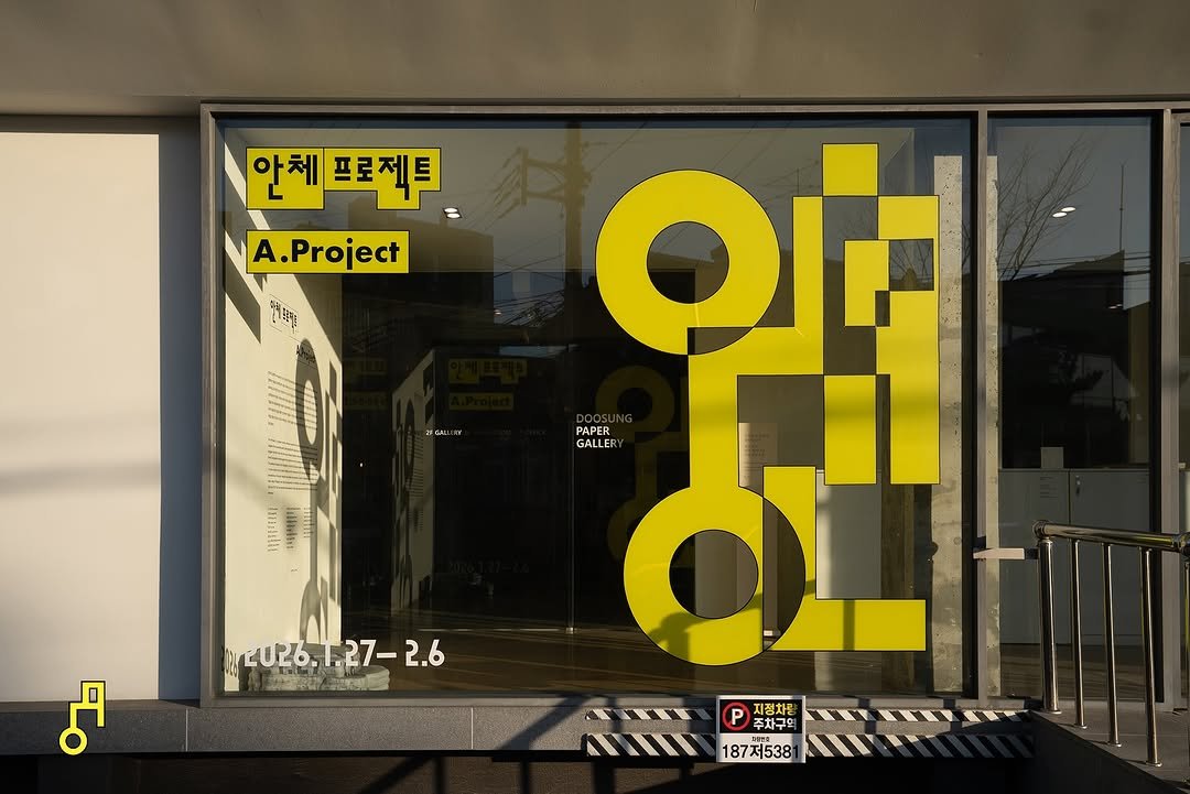
⟪안체 프로젝트 A-Project⟫는 ‘AG 안상수체’ 탄생 40주년을 기념해 진행되는 협업 프로젝트로, 참여 디자이너는 ‘AG 안상수체’ 모듈을 활용해 새로운 탈네모틀 한글꼴을 제작하고, 연구소는 디자이너가 11,172자의 한글을 완성할 수 있도록 제작 과정을 지원하고 있습니다. 2024년 첫 프로젝트에서 탄생한 14종의 한글꼴은 다양한 문화예술 매체를 통해 소개되며 주목을 받았고, 2025년에는 보다 폭넓은 문화·언어권의 디자이너들이 합류해 세벌체에 대한 관점과 조형의 폭을 넓혔습니다. 완성된 글꼴은 2026년 가을에 공개될 예정이며, 현재 후속 프로젝트가 진행 중입니다. ⟪안체 프로젝트 A-Project⟫ 때. 2026년 1월 27일(화) – 2월 6일(금) 평일, 토요일 10:00 – 17:00 / 일요일 휴관 곳. 두성페이퍼갤러리 (서울 서초구 사임당로23길 41)
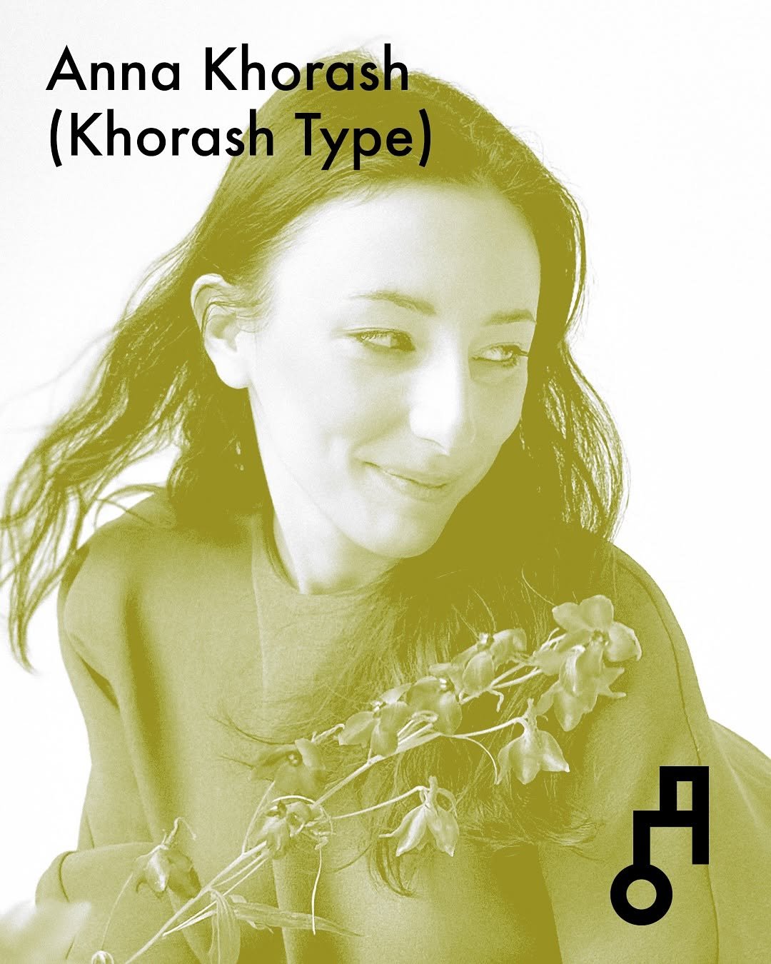
안나 호라쉬 Anna Khorash Netherlands, Khorash Type Anna Khorash is a type designer based in The Hague, Netherlands. After graduating from the TypeMedia program, she works independently, collaborating with type foundries on multi-script type families, developing Latin, Cyrillic, and Hebrew scripts, and creating custom fonts with design agencies. Alongside her design practice, she teaches type design at TypeWest and writes educational articles for Contrast Foundry. Her personal projects are presented on KhorashType.com. Croog is a typeface that combines geometry with softness. Built on a modular system, it achieves a harmonious integration of Latin and hangeul scripts. The family includes two styles: Regular and Shiny. The accompanying poster accentuates the dimensional character of the letters through outlines and shadows, showcasing the expressive potential of combining the two styles at varying sizes. Many of its details were designed to emphasize a sense of volume and light — for instance, certain strokes remain open, while counters in the ovals are closed to enhance the sculptural quality.
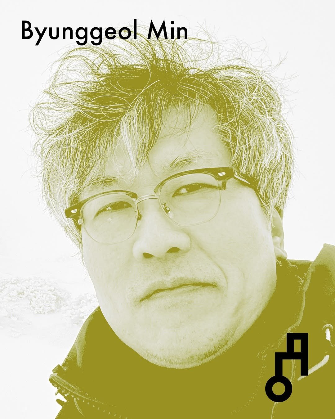
민병걸 Byunggeol Min Republic of Korea Byunggeol Min is a graphic designer. He is interested in utilizing the relationship between the part and the whole as a methodological approach to expression, and undertakes diverse forms of design work that traverse the boundaries between image and materiality. ArchType was designed to be a typeface that directly reveals the rough process of constructing a building, where structures are formed and filled. In contrast, Ahn-Suum aimed to break the solid mass of the existing Ahnsangsoo Typeface and transform it into a lighter character form that evokes a cheerful, ’jangly‘ resonance.
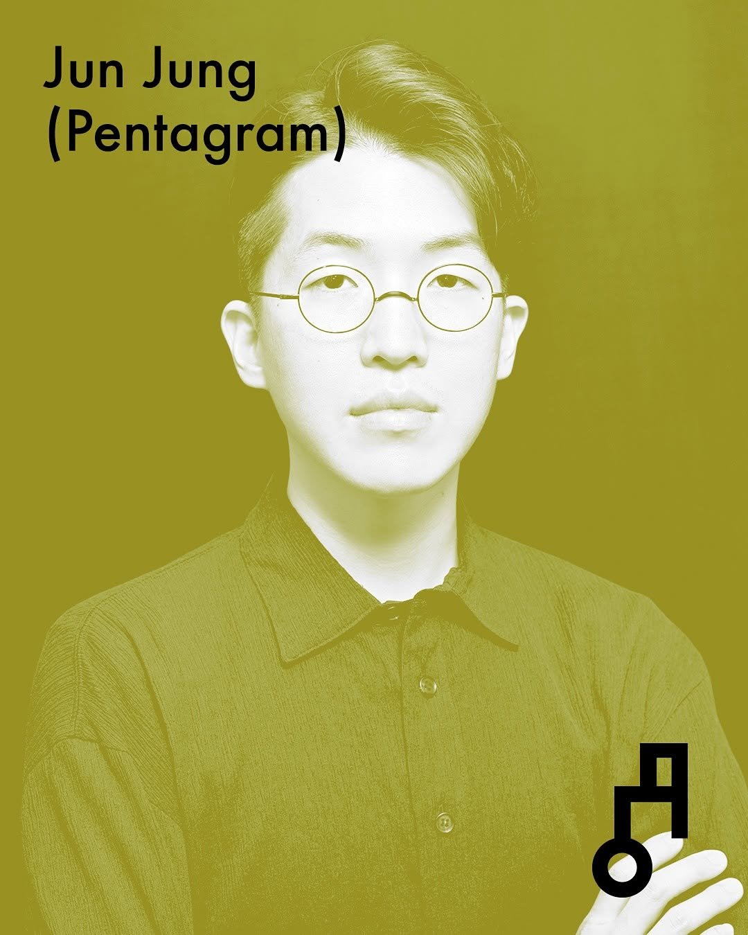
정준기 Jun Jung Republic of Korea, Pentagram Based in New York, they work on typeface design, branding, publications, and spatial design. They currently serve as a Senior Designer at Pentagram. In an era where even ordinary daily moments are becoming mechanized, what can breathe ”life“ into us? The imperfection manifested through the human hand expands the space in our hearts. The Breath Typeface (숨체) is a font that reveals the mechanical modularity of a combination-type font and the humanistic beauty of hangeul using the stenciling technique.
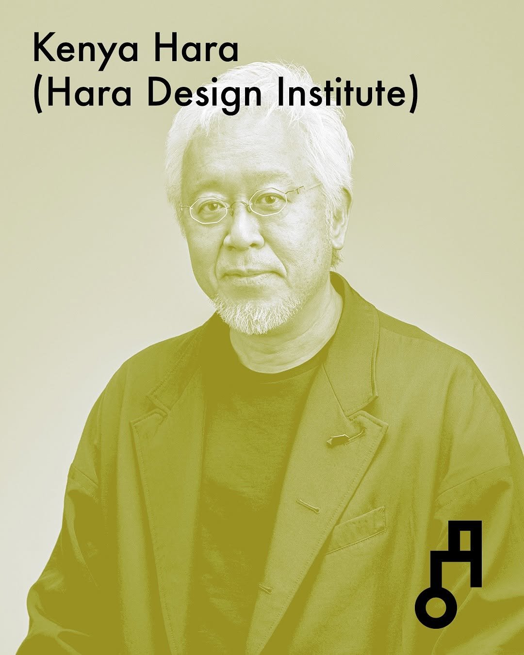
하라 켄야 Kenya Hara Japan, Hara Design Institute Kenya Hara (b.1958) is a graphic designer, president of the Nippon Design Center Inc., and professor at Musashino Art University. His highly-influential exhibition ”RE-DESIGN: Daily Products of the 21st Century“ toured worldwide, and he has built a reputation for producing exhibitions and educational programs that bring focus to new values by embracing keywords, such as “HAPTIC,” “SENSEWARE,” and “Ex-formation.” Much of his work, including the programs for the Opening and Closing Ceremonies of the Nagano Winter Olympic Games and promotion of Expo 2005, is deeply rooted in Japanese culture. In 2002, Hara became MUJI‘s art director. His wide-ranging work is noted for its attention to transparency, and includes visual identity for Matsuya Ginza, Mori Building, Tsutaya Shoten, GINZA SIX, and MIKIMOTO. He was Chief Creative Director of the Japan House project for Japan’s Ministry of Foreign Affairs. Japanese kana characters are written with flowing curves that match the movement of the hand. hangeul characters are created with symbolic rationality and are designed with geometric patterns. Therefore, Flowing Fonts was created with the intention of including the flowing grace of curves in hangeul characters.
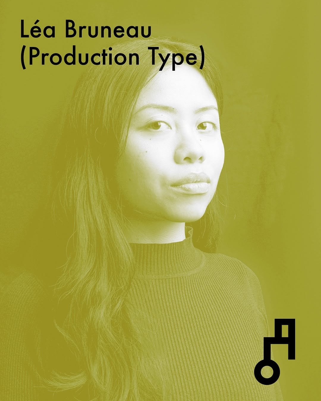
레아 브루노 Léa Bruneau France, Production Type Léa Bruneau is a type designer and calligrapher based in Paris, France. She studied graphic and type design at école Estienne before joining the Master TypeMedia at the Royal Academy of Arts, The Hague. She currently works as a type designer at Production Type while also pursuing freelance projects. Her work combines classic elegance with contemporary sensibilities, creating typefaces and logotypes that can adapt to a wide range of contexts. The design of the typeface is founded as much on the shapes themselves as on the counterforms they create. With ornamental outstrokes, the inline slices through the vertical stems introducing a beam of light within each module of the characters. The poster’s design seeks to create a sense of visual ambiguity, dissolving the boundary between the shape and the background. Front and back seem inseparable, causing the eye‘s gaze lost in contemplation of the shapes.
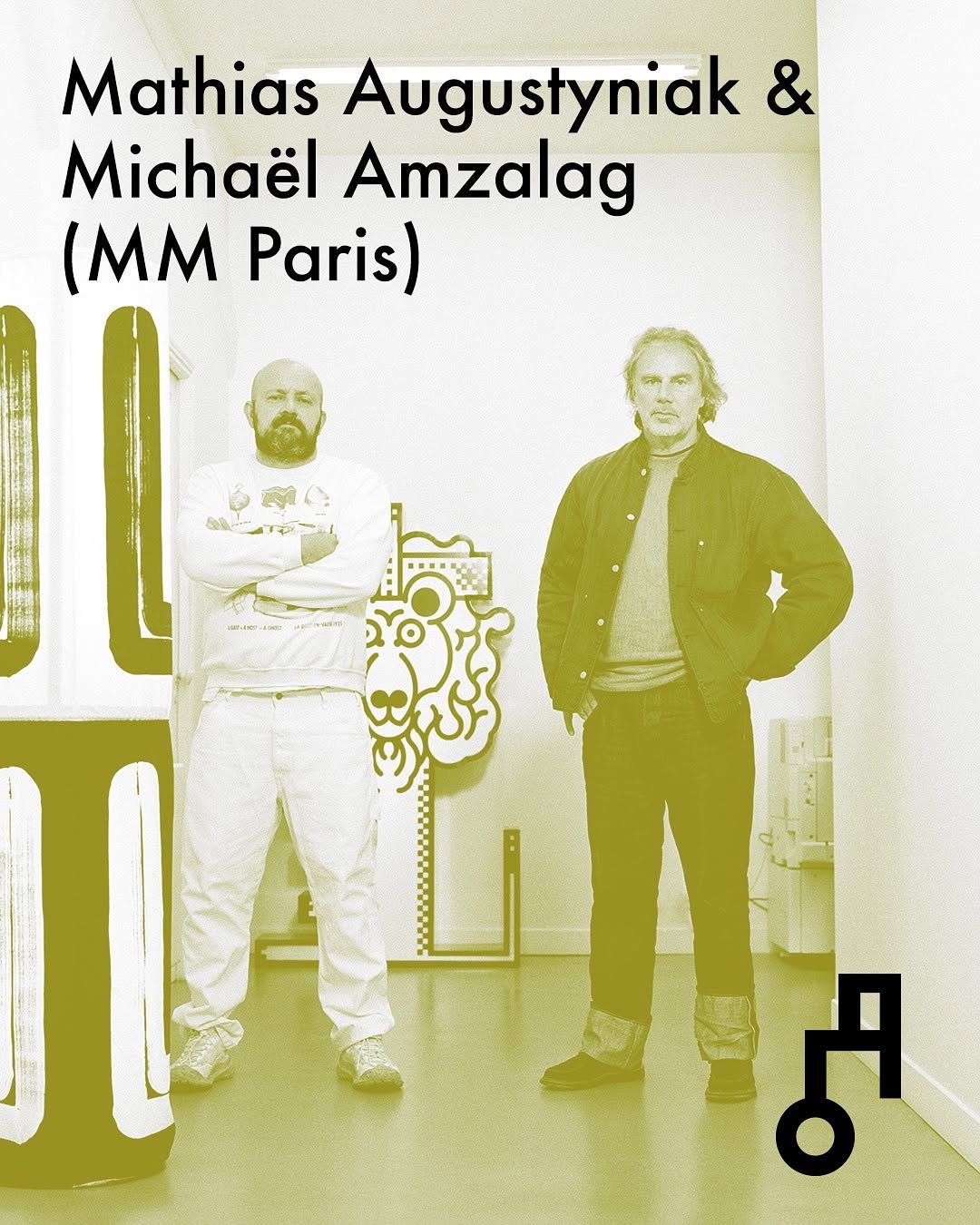
마티아스 오귀스티니악&미카엘 암잘라그 Mathias Augustyniak & Michaël Amzalag France, M/M (Paris) M/M (Paris), established in 1992 by Mathias Augustyniak and Michaël Amzalag, is a distinctive entity in graphic design and creative direction. Their practice is multidisciplinary, integrating contemporary art, fashion, and music, often drawing upon Charles S. Peirce‘s semiotic theory (icons, indexes, symbols) to create a complex visual language. They have collaborated extensively with cultural icons like Björk, Madonna, and luxury fashion houses including Loewe (with Jonathan Anderson since 2013), Balenciaga, and Prada. Their typographic work is documented in ”Letters from M/M (Paris)“. Notable exhibitions include ”Translation“ (2005) and the ”M/M in Shanghai“ retrospective (2020). They established the PROGRAM/ME gallery in 2022 and their work is held in major collections (Centre Pompidou, Tate Modern). M/Magic tarots develops a visual language in which symbols and structures merge into a new, visual grammar. Instead of approaching tarot as an object of belief, we treated it as a design system—a framework that organises narrative and meaning through recurring signs within a constructed system. This logic resonates with the modular foundations of the typeface, originally conceived as a documentation tool to accompany a tarot deck and expanded within the context of the A-project initiative, where modularity forms the core methodology. The typeface operates as a set of interacting modules that can shift, combine, and realign to form both Latin letters and Hangeul jamo. The play between these components allows the two writing systems to coexist while maintaining their distinct rhythms. The poster presents the 22 M/Major Arcanas from the M/Magic tarot deck. Each card displays its name in French and in Korean, highlighting the dialogue between the two scripts within the unified modular structure. The title, “Arcanes M/Majeurs 메이저 아르카나”, is printed in fluorescent orange and pink, and is built on a strict underlying grid. Through this layout, the poster emphasises the potential of the type system and the fluid interplay of its modular elements across languages and formats.