인기 검색 계정


ORDINARY PEOPLE(@ordinarypeople.info) 인스타그램 상세 프로필 분석: 팔로워 39,912, 참여율 1.21%

@ordinarypeople.info
ORDINARY PEOPLE
Graphic design studio based in Seoul and NYC.
http://ordinarypeople.info/@ordinarypeople.info님과 연관된 프로필
연관 프로필이 없습니다
이 계정에 대한 연관 프로필 정보를 찾을 수 없습니다
@ordinarypeople.info 계정 통계 차트
게시물 타입 분포
시간대별 활동 분석 (최근 게시물 기준)
@ordinarypeople.info 최근 게시물 상세 분석
동영상 게시물 분석
여러 장 게시물 분석
@ordinarypeople.info 최근 게시물
![ordinarypeople.info 게시물 이미지: D-3
오디너리피플과 함께할 디자이너를 찾습니다.
☀️
[신입] 그래픽 디자이너...](/static/images/dashboard/ordinarypeople.info/9dcdfc15a1bac20ed8de749ae7efd384.jpg)
D-3 오디너리피플과 함께할 디자이너를 찾습니다. ☀️ [신입] 그래픽 디자이너 0명 [경력] 3년 이하 경력의 그래픽 디자이너 0명 ☀️ 1차 서류, 2차 면접을 거쳐 채용합니다. recruit@ordinarypeople.kr으로 이력서와 포트폴리오(그래픽, 브랜딩, 모션, 3D등 분야 관계없이 자신의 작업을 잘 보여줄 수 있는 결과물)를 PDF 형식으로 보내주세요. 메일 제목 및 파일명에 [신입] 혹은 [경력] 말머리와 성함(국문)을 필수로 기재해주세요. ☀️ 1차 서류 전형 — E-mail 접수: recruit@ordinarypeople.kr — 마감: 2025년 8월 15일(금) 오후 6시(KST) — 합격 여부는 8월 22일(금) 1차 서류 합격자에 한해 개별 통지합니다. — 본 채용은 한국어 의사소통이 가능한 분들을 대상으로 합니다. ☀️ 입사자는 3개월의 수습 기간을 거친 후 정규직으로 채용합니다. 근무 장소: 주식회사 오디너리피플서울/서울시 마포구 성지5길 17, 2층 근무 시간: 월–금 10:00–19:00 보수: 협의하에 결정
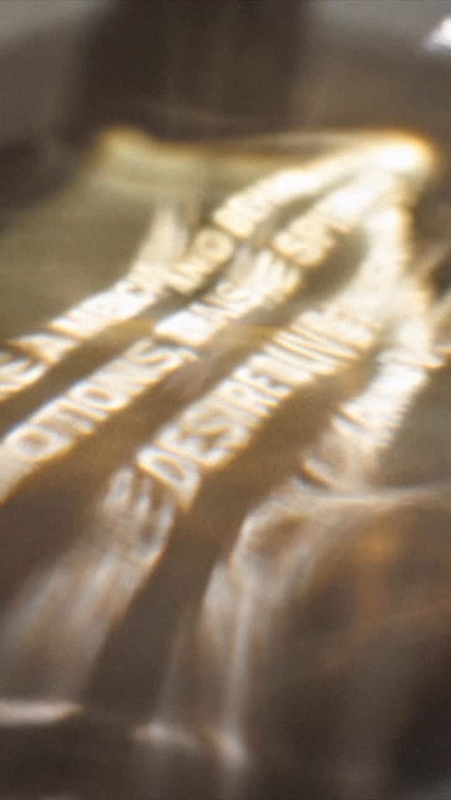
「Through the Light」는 《IDEA》 매거진 408호에 수록된 COMME des GARÇONS PARFUMS 30주년 북클릿을 위한 비주얼 콘셉트입니다. COMME des GARÇONS의 태도가 향으로 변하고, 그 향이 각자의 몸에 닿듯, 이 프로젝트는 향수병을 통과한 빛이 텍스트를 비추는 방식으로 향의 이미지를 시각화합니다. 태도에서 향으로, 향에서 빛으로, 빛에서 시각적 결과물로. 빛은 향수병을 통과하거나 반사되어 텍스트 위로 흩어집니다. 그것은 제품을 직접적으로 드러내지 않고, 주변에 하나의 분위기를 만듭니다. 향이 미세한 입자로 퍼져 몸에 스며들듯, 빛 또한 같은 방식으로 움직이며, 단어들 위로 퍼지고 하나의 이미지를 만들어냅니다. “Through the Light” is a visual concept developed for the 30th anniversary of the COMME des GARÇONS PARFUMS Booklet, featured in IDEA magazine (No.408). Just as COMME des GARÇONS’ attitude transforms into fragrance and touches each person’s body, the image of the perfume is materialized through text illuminated by light passing through the bottle. From attitude, to fragrance. From fragrance, to light. From light, to visual output. After passing through or reflecting off the bottle, the light scatters across the text. It does not highlight the product — it creates an atmosphere. Just as perfume disperses through particles and spreads over the body, light behaves in the same way — scattering across the words, and forming an image. Text Madoka Nishi Photography Syunta Inaguchi and Satoshi Aoyagi
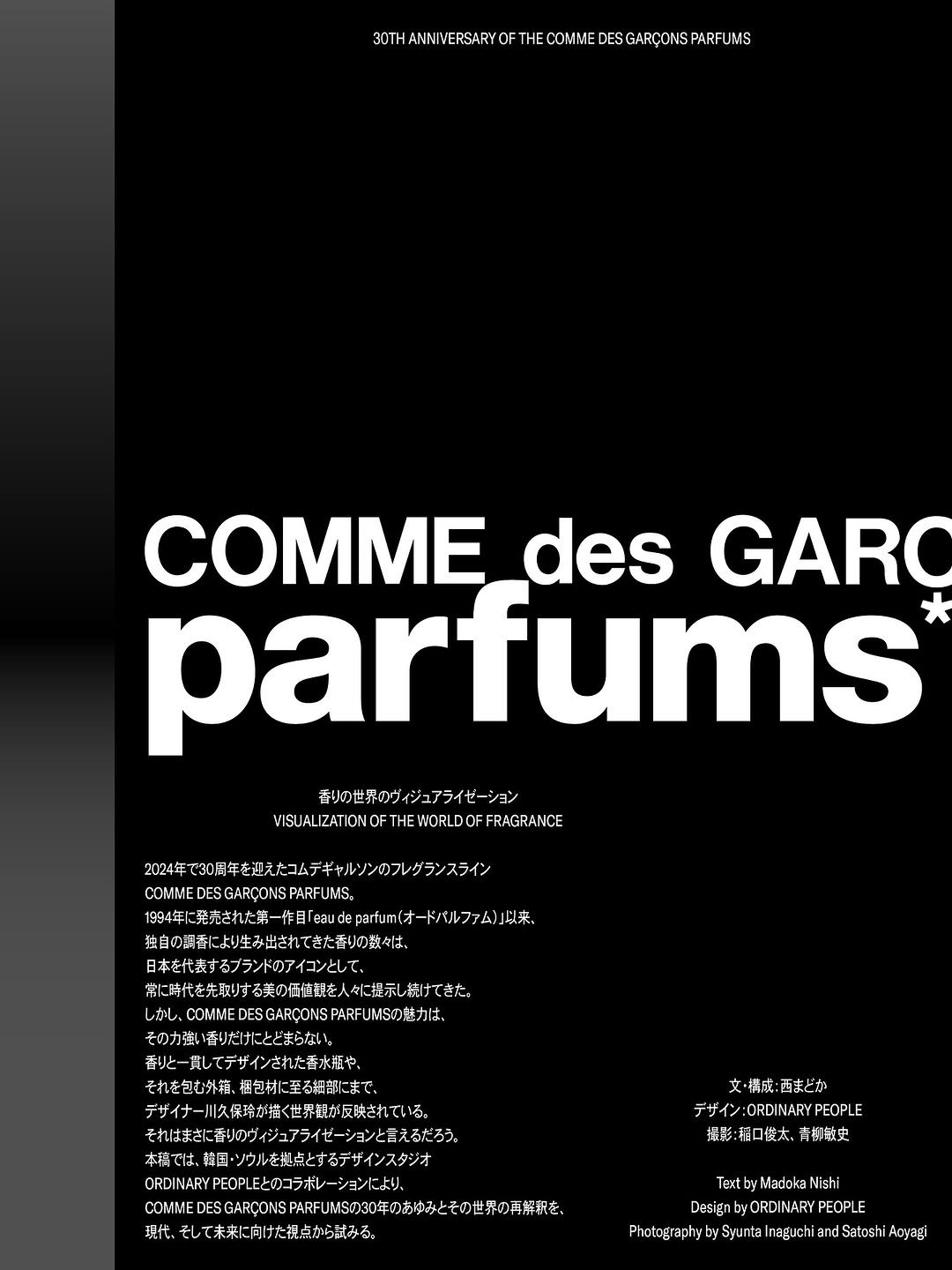
「Through the Light」는 《IDEA》 매거진 408호에 수록된 COMME des GARÇONS PARFUMS 30주년 북클릿을 위한 비주얼 콘셉트입니다. COMME des GARÇONS의 태도가 향으로 변하고, 그 향이 각자의 몸에 닿듯, 이 프로젝트는 향수병을 통과한 빛이 텍스트를 비추는 방식으로 향의 이미지를 시각화합니다. 태도에서 향으로, 향에서 빛으로, 빛에서 시각적 결과물로. 빛은 향수병을 통과하거나 반사되어 텍스트 위로 흩어집니다. 그것은 제품을 직접적으로 드러내지 않고, 주변에 하나의 분위기를 만듭니다. 향이 미세한 입자로 퍼져 몸에 스며들듯, 빛 또한 같은 방식으로 움직이며, 단어들 위로 퍼지고 하나의 이미지를 만들어냅니다. “Through the Light” is a visual concept developed for the 30th anniversary of the COMME des GARÇONS PARFUMS Booklet, featured in IDEA magazine (No.408). Just as COMME des GARÇONS’ attitude transforms into fragrance and touches each person‘s body, the image of the perfume is materialized through text illuminated by light passing through the bottle. From attitude, to fragrance. From fragrance, to light. From light, to visual output. After passing through or reflecting off the bottle, the light scatters across the text. It does not highlight the product — it creates an atmosphere. Just as perfume disperses through particles and spreads over the body, light behaves in the same way — scattering across the words, and forming an image. Text Madoka Nishi Photography Syunta Inaguchi and Satoshi Aoyagi
![ordinarypeople.info 게시물 이미지: 오디너리피플과 함께할 디자이너를 찾습니다.
☀️
[신입] 그래픽 디자이너...](/static/images/dashboard/ordinarypeople.info/03bc73b84b08b6f082d0d89d2903ad43.jpg)
오디너리피플과 함께할 디자이너를 찾습니다. ☀️ [신입] 그래픽 디자이너 0명 [경력] 3년 이하 경력의 그래픽 디자이너 0명 ☀️ 1차 서류, 2차 면접을 거쳐 채용합니다. recruit@ordinarypeople.kr으로 이력서와 포트폴리오(그래픽, 브랜딩, 모션, 3D등 분야 관계없이 자신의 작업을 잘 보여줄 수 있는 결과물)를 PDF 형식으로 보내주세요. 메일 제목 및 파일명에 [신입] 혹은 [경력] 말머리와 성함(국문)을 필수로 기재해주세요. ☀️ 1차 서류 전형 — E-mail 접수: recruit@ordinarypeople.kr — 마감: 2025년 8월 15일(금) 오후 6시(KST) — 합격 여부는 8월 22일(금) 1차 서류 합격자에 한해 개별 통지합니다. — 본 채용은 한국어 의사소통이 가능한 분들을 대상으로 합니다. ☀️ 입사자는 3개월의 수습 기간을 거친 후 정규직으로 채용합니다. 근무 장소: 주식회사 오디너리피플서울/서울시 마포구 성지5길 17, 2층 근무 시간: 월–금 10:00–19:00 보수: 협의하에 결정
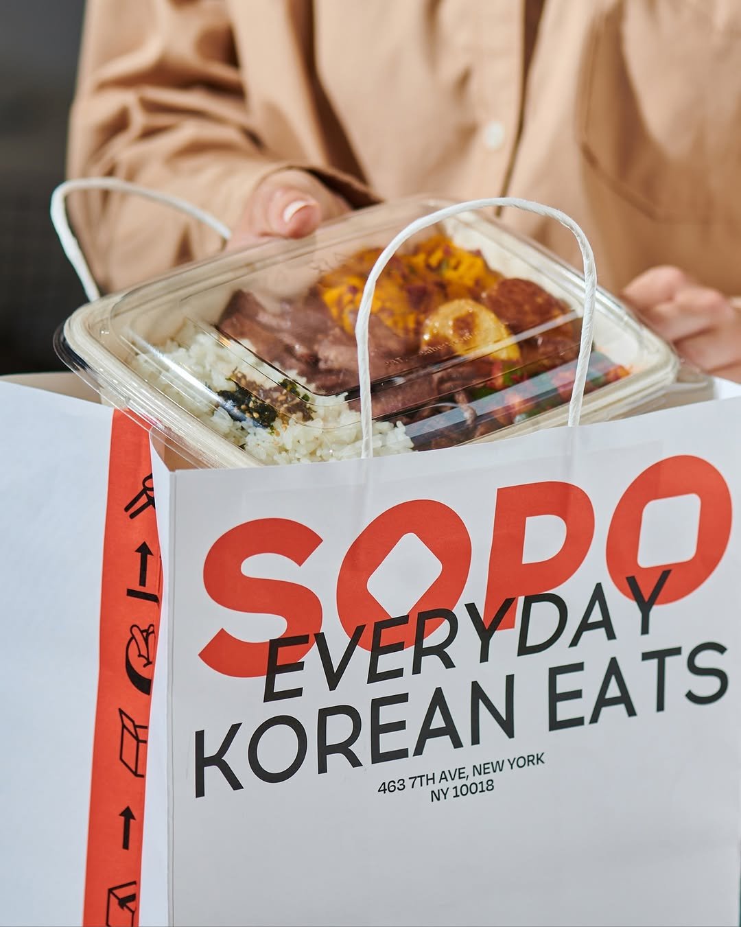
뉴욕 맨해튼 7번가에 1호점을 오픈한 한식 캐주얼 레스토랑 “SOPO”의 브랜드 아이덴티티를 디자인했습니다. SOPO는 ”음식은 우리 문화의 가장 훌륭한 부분 중 하나“라는 믿음으로 시작된 브랜드입니다. 고객들은 다양한 프로틴, 소스, 곁들임 반찬을 선택해 자신만의 한국식 BBQ 플래터를 구성하거나, 즉석에서 만들어지는 김밥을 즐길 수 있습니다. ‘작은 꾸러미들’을 의미하는 “소포”는 한국의 맛을 간편하고 친근하게 전달합니다. SOPO의 브랜드 아이덴티티는 한국의 한상차림과 한식 요소를 현대적으로 재해석한 디자인을 통해 정통성 있는 한식을 친숙하고 현대적인 이미지로 표현합니다. 브랜드의 핵심이 되는 한글 자소 “소포”의 형태적 특성은 심볼, 워드마크의 속공간, 이미지 프레임 요소 등으로 자연스럽게 확장되어 다양한 매체에서 효과적으로 활용됩니다. We designed the brand identity for “SOPO,” a Korean casual dining restaurant that opened its first location on 7th Avenue in Manhattan, New York. SOPO was founded on the belief that “food is one of the best parts of our culture.” Customers can build their own Korean BBQ platter by selecting from a variety of proteins, sauces, and side dishes, or enjoy freshly rolled kimbap made to order. Meaning “small parcels,” SOPO brings the flavors of Korea to life in a way that is both approachable and convenient. SOPO’s brand identity visualizes traditional Korean dining, ‘Hansang Charim’ (a table filled with carefully prepared dishes), into a modern design, presenting authentic Korean food with a friendly and contemporary aesthetic. The distinctive features of the Korean characters in “소포” are seamlessly woven into various brand elements, including the symbol, the counter spaces of the SOPO wordmark, and image framing components, effectively utilized across diverse media. Client SOPO @eatsopo Bx Design Spreadworks @spread.works Motion Graphic Beatrice @studio.beatrice.kr Image Source SOPO
뉴욕 맨해튼 7번가에 1호점을 오픈한 한식 캐주얼 레스토랑 “SOPO”의 브랜드 아이덴티티를 디자인했습니다. SOPO는 “음식은 우리 문화의 가장 훌륭한 부분 중 하나”라는 믿음으로 시작된 브랜드입니다. 고객들은 다양한 프로틴, 소스, 곁들임 반찬을 선택해 자신만의 한국식 BBQ 플래터를 구성하거나, 즉석에서 만들어지는 김밥을 즐길 수 있습니다. ‘작은 꾸러미들’을 의미하는 “소포”는 한국의 맛을 간편하고 친근하게 전달합니다. SOPO의 브랜드 아이덴티티는 한국의 한상차림과 한식 요소를 현대적으로 재해석한 디자인을 통해 정통성 있는 한식을 친숙하고 현대적인 이미지로 표현합니다. 브랜드의 핵심이 되는 한글 자소 “소포”의 형태적 특성은 심볼, 워드마크의 속공간, 이미지 프레임 요소 등으로 자연스럽게 확장되어 다양한 매체에서 효과적으로 활용됩니다. We designed the brand identity for “SOPO,” a Korean casual dining restaurant that opened its first location on 7th Avenue in Manhattan, New York. SOPO was founded on the belief that “food is one of the best parts of our culture.” Customers can build their own Korean BBQ platter by selecting from a variety of proteins, sauces, and side dishes, or enjoy freshly rolled kimbap made to order. Meaning “small parcels,” SOPO brings the flavors of Korea to life in a way that is both approachable and convenient. SOPO’s brand identity visualizes traditional Korean dining, ‘Hansang Charim’ (a table filled with carefully prepared dishes), into a modern design, presenting authentic Korean food with a friendly and contemporary aesthetic. The distinctive features of the Korean characters in “소포” are seamlessly woven into various brand elements, including the symbol, the counter spaces of the SOPO wordmark, and image framing components, effectively utilized across diverse media. Client SOPO @eatsopo Bx Design Spreadworks @spread.works Motion Graphic Beatrice @studio.beatrice.kr Image Source SOPO
‘가능성을 지원하고 연결한다’. 새롭게 정의한 카페24의 브랜드 에센스를 바탕으로, 브랜드의 핵심 가치를 재정립하고 슬로건 ‘Idea is Business’와 함께 지향하는 비전과 철학을 명확히 전달하는 브랜드 아이덴티티를 구축했습니다. 새롭게 설계된 키비주얼은 카페24가 지닌 본질적 가치인 ’연결’을 시각화한 것으로, 다양한 방식으로 확장 가능한 그래픽 툴로 기능합니다. 특히, 카페24만을 위해 개발한 독자적인 그래픽 제너레이터는 브랜드 내부에서 유연하게 시각 요소를 제작할 수 있도록 하여, 글로벌 커머스 플랫폼에서 발생하는 다양한 상황에 효과적으로 대응합니다. 이를 통해, 브랜드 메시지인 ’연결’을 일관되면서도 상징적으로 전달합니다. “Empowering and Connecting Possibilities.” Building on Cafe24’s newly defined brand essence, we reestablished its core values and identity, conveying the brand’s vision and philosophy in alignment with the slogan “Idea is Business.” The newly developed visual system depicts Cafe24’s core value—connection—as a versatile graphic tool with scalable applications. Notably, a custom-built graphic generator developed exclusively for Cafe24 enables the internal team to flexibly create visual elements and effectively address the diverse needs of a global commerce platform. This framework enables the brand message of connection to be delivered with consistency and strong visual clarity. Client Cafe24 @cafe24korea Motion Graphic Beatrice @studio.beatrice.kr Generator Doodle Finger (Jeonghyo) @doodlefingers Slogan Design Jo Sohee @wrkjoewrk
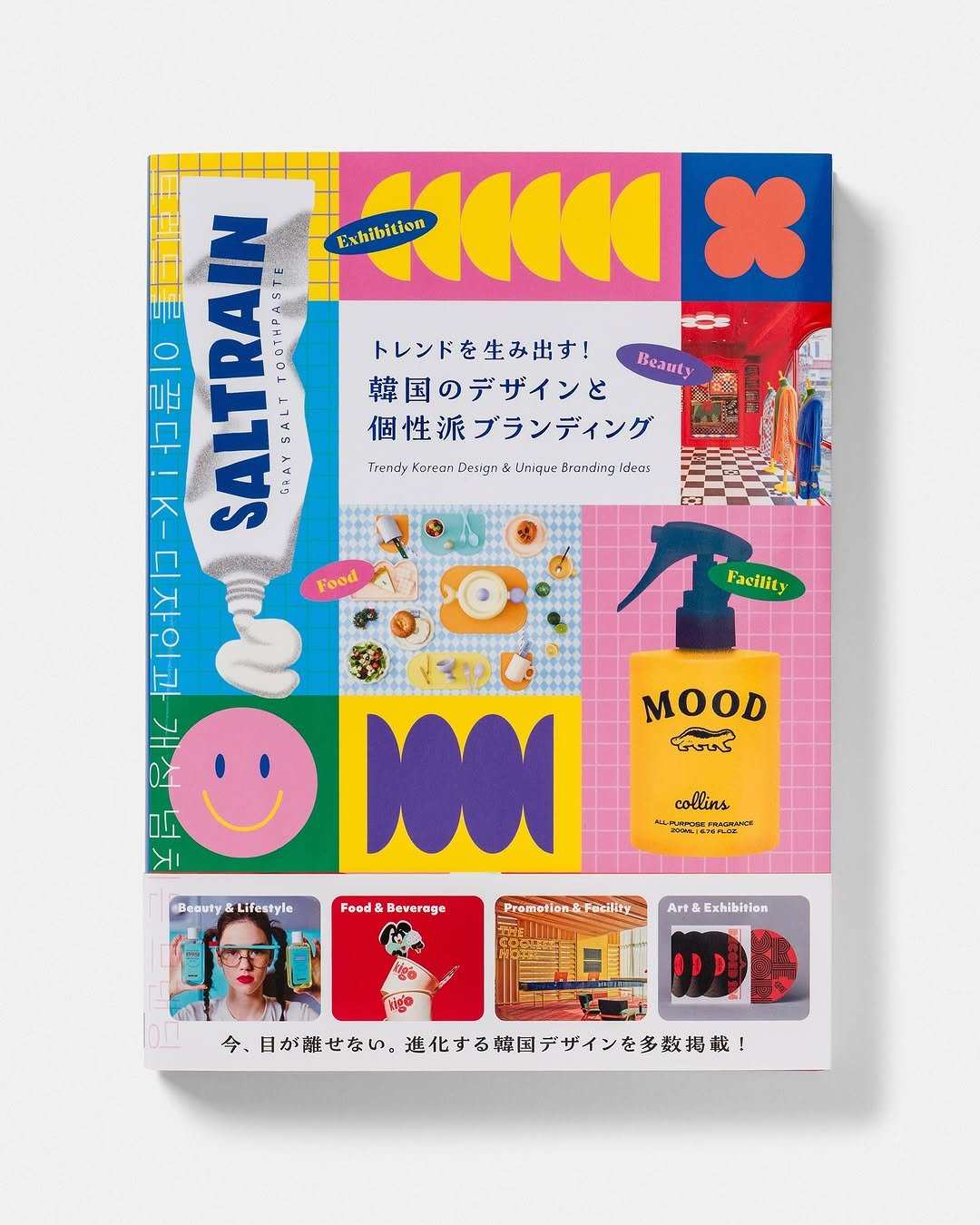
2023 년 여름에 진행한 핏타민 @fitamin_official 의 패키지와 팝업 스토어 월그래픽 작업이 @pieintlglobal 의 <Trendy Korean Design & Unique Branding Ideas>에 소개되었습니다. 💊 The packaging and pop-up store wall graphics we designed for Fitamin (@fitamin_official) in the summer of 2023 have been featured in @pieintlglobal’s book Trendy Korean Design & Unique Branding Ideas.
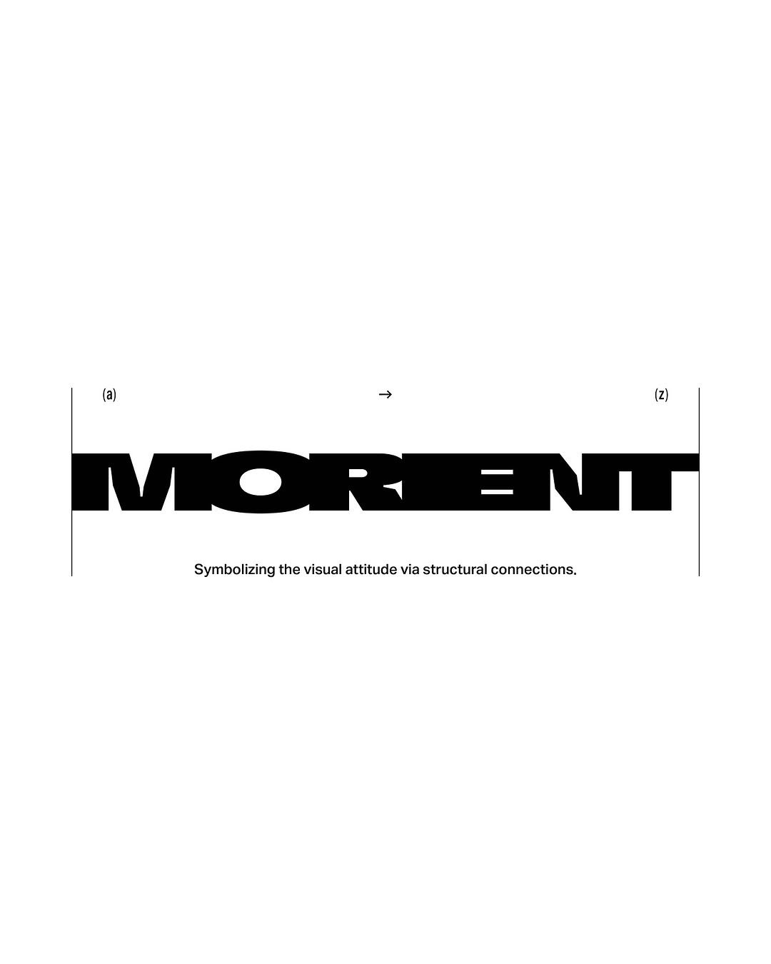
Morient가 추구하는 태도를 ‘끝을 인지함‘에서 출발해 ‘새로움에 대한 갈망‘을 지나, 결국 ‘발화’로 귀결되는 창작의 과정으로 해석했습니다. 각 과정, [인지 → 갈망 → 발화]는 각각 See, Seek, Spark로 전환되며 레이블의 태도를 상징하는 슬로건이 되고, 끝에 대한 인지를 통해 새로움으로 나아가는 이 여정은 시각화 방식의 기초가 되어 결과물을 구성하는 장치로 활용됩니다. We interpreted Morient’s attitude as a process of creation beginning with the awareness of an end, moving through a longing for newness, and ultimately culminating in ignition. The three stages of See → Seek → Spark distill the label’s ethos, and the progression from see to spark inform both the visual structure and the intended outcome. Client Morient Motion Graphic Beatrice
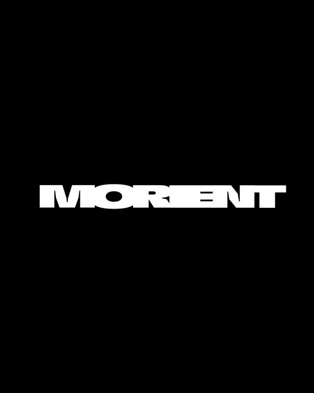
Morient가 추구하는 태도를 ‘끝을 인지함‘에서 출발해 ‘새로움에 대한 갈망‘을 지나, 결국 ‘발화’로 귀결되는 창작의 과정으로 해석했습니다. 각 과정, [인지 → 갈망 → 발화]는 각각 See, Seek, Spark로 전환되며 레이블의 태도를 상징하는 슬로건이 되고, 끝에 대한 인지를 통해 새로움으로 나아가는 이 여정은 시각화 방식의 기초가 되어 결과물을 구성하는 장치로 활용됩니다. We interpreted Morient’s attitude as a process of creation beginning with the awareness of an end, moving through a longing for newness, and ultimately culminating in ignition. The three stages of See → Seek → Spark distill the label’s ethos, and the progression from see to spark inform both the visual structure and the intended outcome. Client Morient Motion Graphic Beatrice
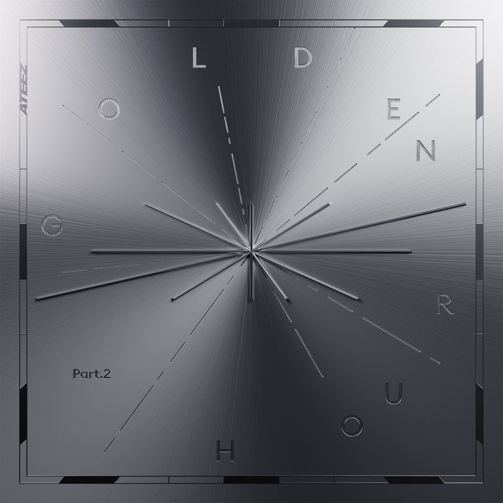
ATEEZ의 11번째 미니앨범 GOLDEN HOUR : Part.2의 그래픽 아이덴티티를 디자인했습니다. We designed the graphic identity for ATEEZ’s 11th mini album, GOLDEN HOUR : Part.2. Client KQ Entertainment Digital Cover Woosung Lee Portfolio Photography Jinsol Kim
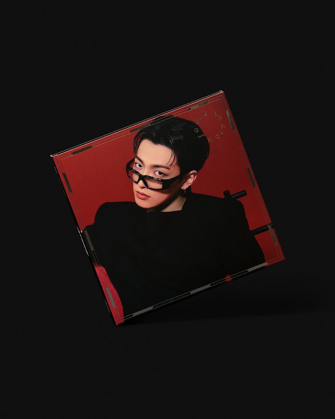
ATEEZ의 11번째 미니앨범 GOLDEN HOUR : Part.2는 “Every Loving Hour”라는 비주얼 콘셉트를 바탕으로, 시간 속에서 ATEEZ가 만들어가는 찬란한 순간들을 빛과 흐름의 언어로 그려냅니다. 아이덴티티 디자인은 시계 모티프를 중심으로 시간성과 영속성을 상징적으로 담아냈습니다. 12개의 선으로 구성된 ATEEZ 로고는 시간의 흐름을, 랜덤하게 확장되는 8개의 선은 멤버들의 고유한 존재감을 상징합니다. 이러한 시간의 요소들은 타이포그래피 전반에 다양한 방식으로 해석되어 앨범 전체 디자인 언어로 확장됩니다. ‘GOLDEN HOUR : Part.2’의 음악과 함께, 시각적·촉각적인 내러티브를 통해 ATEEZ의 빛나는 순간을 경험할 수 있도록 하며, 팬들에게 특별한 감각적 서사를 전하고자 했습니다. Our design of ATEEZ’s 11th mini album, GOLDEN HOUR : Part.2, was guided by the visual concept “Every Loving Hour.” The album captures luminous moments of time translated into a language of light, flow, and resonance. We used a clock motif to anchor the identity system, symbolizing time’s continuity and permanence. The ATEEZ logo, reinterpreted as 12 radiating lines, embodies the passage of time, while the eight other extending lines represent the unique presence of each group member. Interpreted typographically, these elements expand into a cohesive visual language that runs throughout the entire album design. Harmonizing with the music, the immersive visual and tactical design invites fans to experience ATEEZ’s shining moments in time. Client KQ Entertainment Portfolio Photography Jinsol Kim